umm idk in away it looked good but then it doesnt 
well...
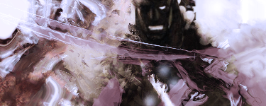
- Render and background of the sig isn't flowing well
- Too many random effects, making the sig look like some broken jigsaw puzzle
- The sig's colors do not have a good harmony with each other
- and yes, as much as good posing that Sagat SvC artwork has, the shadow of his face and rest of his frontal features just make it too hard to make a good signature out off..
you gotta try harder fellow user. And for one, read a few tutorials as well (even though they are NOT 100% Help, its better than nothing)


 April Fools